
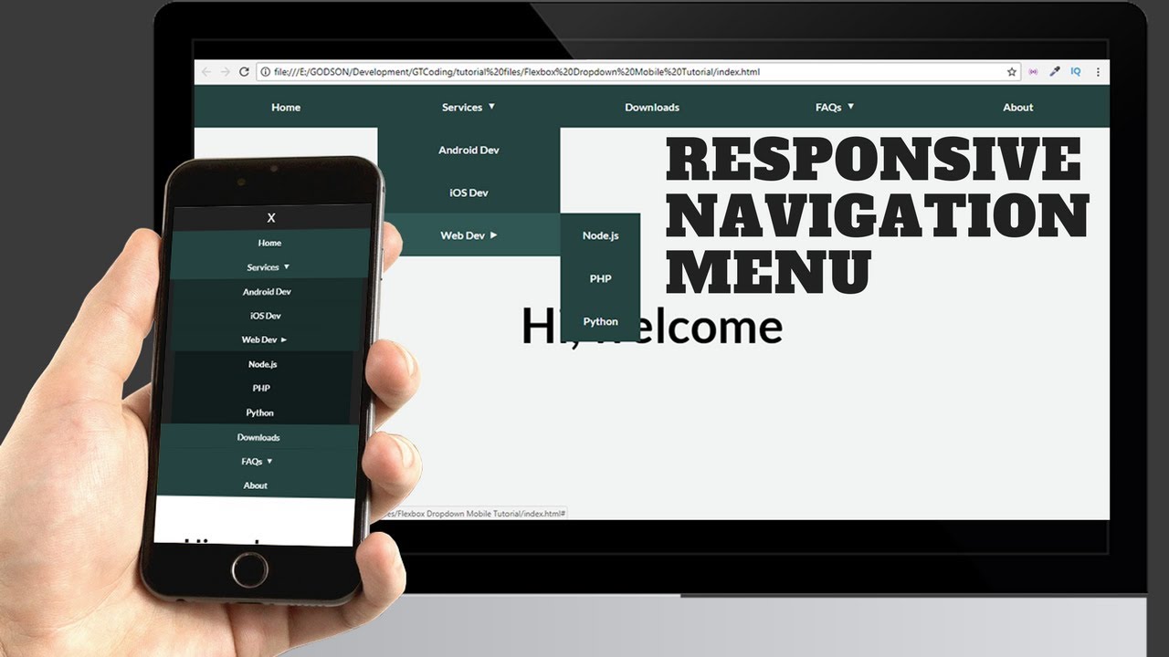
Hi friends, in this video you will learn how to create a responsive mobile dropdown navigation using HTML, CSS and Javascript. I already have a video on creating a dropdown navigation using Flexbox, but in this video we are going to add responsiveness to it and make it work on mobile devices as well.
We are having the same HTML markup that we had for the desktop navigation menu. We are adding some media queries and also some JavaScript to make it work on mobile.
You will also learn how to execute your JavaScript only when there are media queries applied.
If you don’t know much about JavaScript you can watch my playlist on Javascript: https://www.youtube.com/playlist?list=PL0-e1OMq5RP5liYpfTl0dUFaZdPNAbjav
source
Leave a Reply