
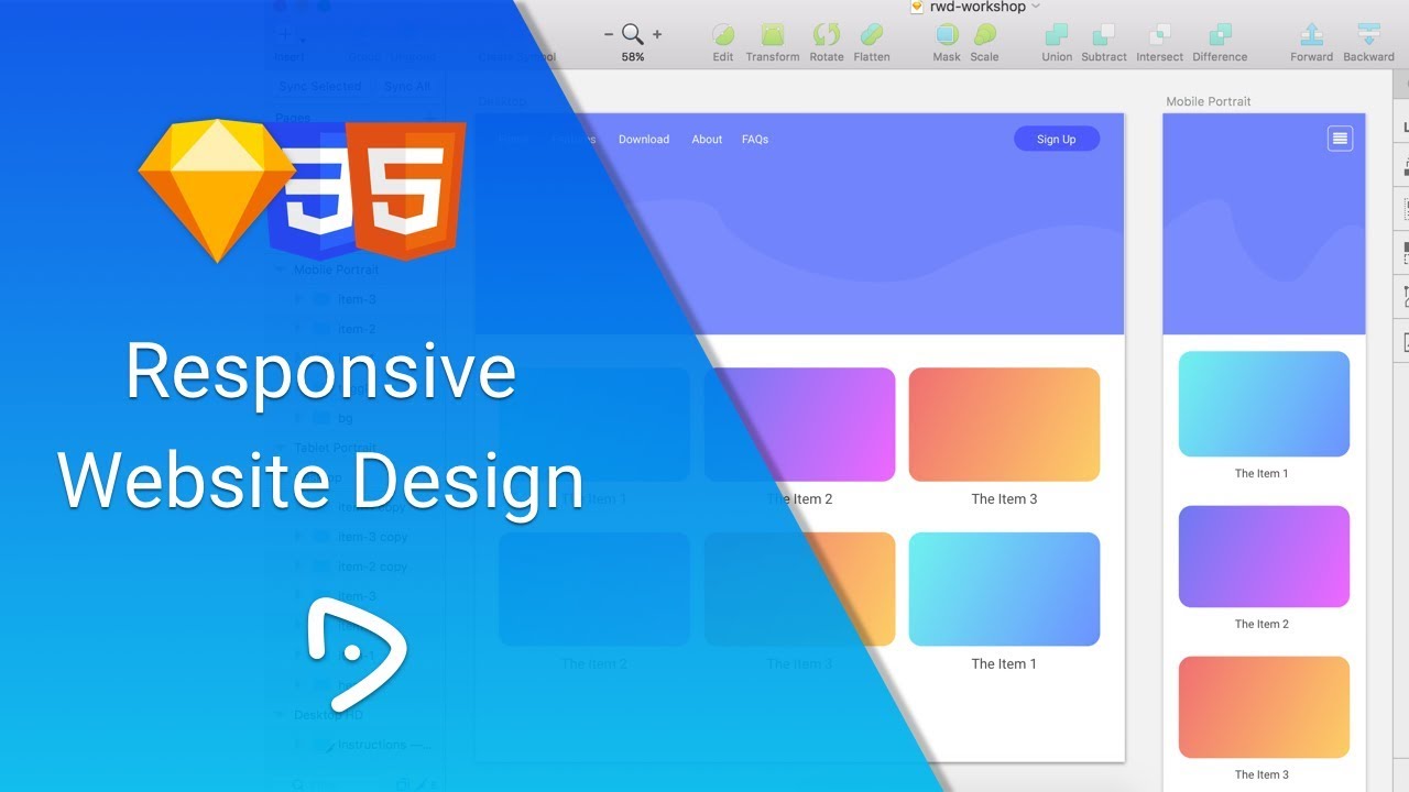
Hi, welcome to my video and we are going to learn how to designing the responsive website design by using Sketch app including Bootstrap framework’s #grid system to make it easier when we are dividing the columns of row.
You can check the Bootstrap grid system for the detail information here:
https://getbootstrap.com/docs/3.3/css/grid
If you don’t have Sketch app, you can download and prepare the assets below here:
https://drive.google.com/open?id=0BzY3iJMSeOq5RllFVzRPREJiS3c
Happy design and see you in the next video 🙂
My lovely app to work:
Wireframing:
– Mockplus: www.mockplus.com/?r=grace
– Pen and Book
– Balsamiq: www.balsamiq.com
User-Interface Designing
– Sketch App: www.sketchapp.com
– Gravit Designer: www.designer.io
Prototyping
– Flinto: www.flinto.com
– Marvelapp: www.marvelapp.com
– Invision: www.invisionapp.com
Collaborating
– Zeplin
– Abstract App
Communication
– Slack: www.slack.com
– Skype: www.skype.com
– Telegram: www.telegram.org
Task Management
– Basecamp: www.basecamp.com
– Trello: www.trello.com
– GetHarvest: www.getharvest.com
Development
– Sublime Text: www.sublimetext.com
– Android Studio
– XCode
—
Take My Course:
udemy.com/user/angga-risky
My Portfolio:
dribbble.com/anggarisky
behance.net/anggarisky
My Site:
anggarisky.com
garudapixel.com
Connect Me:
fb.me/anggariskys
instagram: anggarsky
source
Leave a Reply