
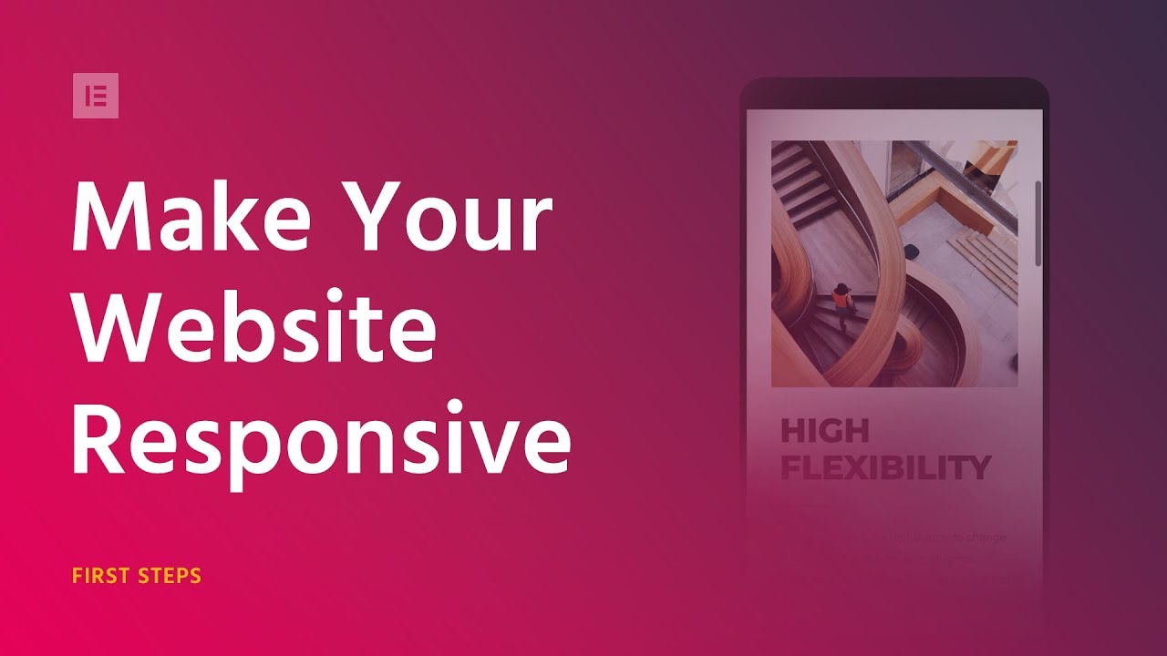
Responsive Web Design means making your website look good on all devices (desktops, tablets, and mobile phones).
Get Elementor, free forever, including mobile editing: https://elementor.com
In this video, we show five ways in which you can use the Free Elementor Page Builder for WordPress to edit any site and make it 100% mobile responsive.
The methods we cover include:
– Mobile font size
– Reverse columns
– Responsive column width
– Padding and margin
– Hide and show elements
These 5 methods are enough to make any page look amazing on mobile screens.
Start using Elementor to create stunning responsive websites.
Download Elementor Free: https://elementor.com
Read more on mobile editing: https://docs.elementor.com/article/68-mobile-editing
source
Leave a Reply