
Let’s explore the Dance Club template from Wix.com. Learn Web design along the way, from a Wix Certified Trainer.
I will teach you how to build Wix websites from concept to automation at www.webmasteracademy.online
This graphic and hip design puts your music venue’s unique content front and center. Use Wix events to promote and sell tickets for your upcoming shows and share the latest news using the cool Wix blog. Let clubbers know what musical vibe to expect by linking to your social media feeds including Spotify and Soundcloud.
Good for a dance club, live performance theaters, or a concert venue
Partial Transcript
Hello everyone. Welcome to the Webmaster Academy. I’m Michael Wood and I am the owner and chief web designer at Captivatim Multimedia and Web Design.
Tonight I’m going to be talking about the Dance Club template from Wix.com. This template is good for anybody who wants to have a website that showcases their unique content. Whether you’re a nightclub, a dance club, or maybe a theater, and you host live performances, or maybe you’re a traveling group of actors and actresses who go around to different venues and you want to keep your fans aware of the different performances you have. So this doesn’t have to be a fixed location if you fit any category where you have different venues and you just want to showcase how unique your content is to the people, this is going to be a great template for you. We’re gonna to use Wix blogs and we’re going to use Wix events to make things happen behind the scenes.
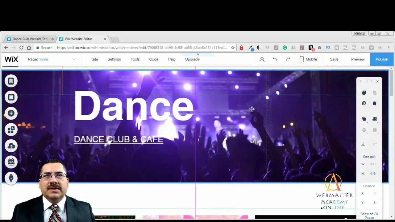
The first thing I’m going to do is do a walk-through of this template and then I’ll go under the hood and I’ll show you how you can customize the template for your own business or service. Let’s do our quick tour of the actual website itself. This fictitious dance club is called Frame and it has a little animation. This red cursor here blinks from time to time that’s a quick little animation. The menu at the top features the social media links and these are text, instead of buttons. You’re probably used to seeing text or social media buttons so the text is a little bit of a different design. It has Facebook, Spotify, Instagram, and Soundcloud. Then over on the left hand side, we have “program, news, cafe, and, info” under the menu navigation and then the name of the club is at the very top
left, which in this case, is called Frame.
When I scroll down, you could see the first things are the posters or the events that are happening at this particular club and here on the left we have “Technicolor and Friends Friday”, tropical-island showcase, and the “Alpha toys by DJ Mikey” going on February 25th. These are three major events that are happening. If the user uses the mouse and they scroll over, there’s a slide animation that happens, and the slide just gives you more information on that particular venue. In this case, it gives the name, the date, the time, and the location of this event. I scroll over and you could see that the information simply hovers and moves or slides in. So it’s nice because there’s no clicking that has to happen. It’s very smooth animations right there. Then as I scroll down you see there are info buttons if they want to know more about that particular venue. Then there’s a News section and here you have some very interesting art. It works kind of like a blog. Here we scroll down and we see that the news in this case is just one major article.
Then further down, you can learn more about the cafe
itself. There’s a photo of the cafe and a quick little description here on the right. It’s letting you know that breakfast is served all day. Then there’s a subscribe box down on the bottom left. When someone puts their address in there you will get their address on the Wix back end and that’ll help build up your email list. You can then take that list and send out different emails to the people. You could even use Wix Shoutouts to create very quickly some colorful and very well designed emails out. It has the copyright information down at the bottom and here’s the social media buttons or icons down on the bottom right. In the footer, you’ll notice the footer is the same color as the page background. In this case it’s white, so the footer doesn’t really stand out. It’s just part of the website, so this is a very minimalistic approach. There’s a lot of text on this site, which, you know, can be a little bit more of a modern feel to it. If I click on program, it goes to another web page actually and it’s called “this week” and it tells them what’s going on this week. In this case, it’s “Technicolor and friends” You notice the menu at the top is persistent as I scroll down. Then it tells you what’s going on next week so here’s “this week” and then here’s “next week”.
If I click on info for a particular venue, it will give you the details and it gives them the “register now button” so they can register for each one of these events…
Full transcript at www.webmasteracademy.online
source
Leave a Reply